Project Overview
As the lead user experience designer for NCR's self-checkout system, I spearheaded a transformative initiative aimed at reimagining the user experience within the retail self-checkout landscape. Our primary objective was to establish a comprehensive baseline for measuring the success of a new generation design, setting a benchmark for usability and customer satisfaction.
Our journey began with a thorough audit of the legacy self-checkout system. Unlike the past, where design decisions were made without sufficient user research, we adopted a user-centric approach this time. We conducted extensive usability tests to capture a holistic understanding of user needs, pain points, and expectations. This data-driven approach allowed us to identify areas of both high and low performance within the legacy system, laying the groundwork for meaningful design improvements.

Findings
One of the key findings from our study revolves around the strategic use of animations to enhance the user experience within the self-checkout prototype. Drawing upon insights from Nielsen Norman Group and industry best practices, we examined the role of animations in guiding user interactions and facilitating intuitive navigation.
Our analysis revealed a nuanced balance when it comes to employing animations effectively. While animations can captivate user attention and add a layer of visual appeal, their excessive or misaligned use can create content roadblocks and impede task completion. This insight prompted us to conduct a deeper investigation into the appropriateness of animations throughout the user journey.
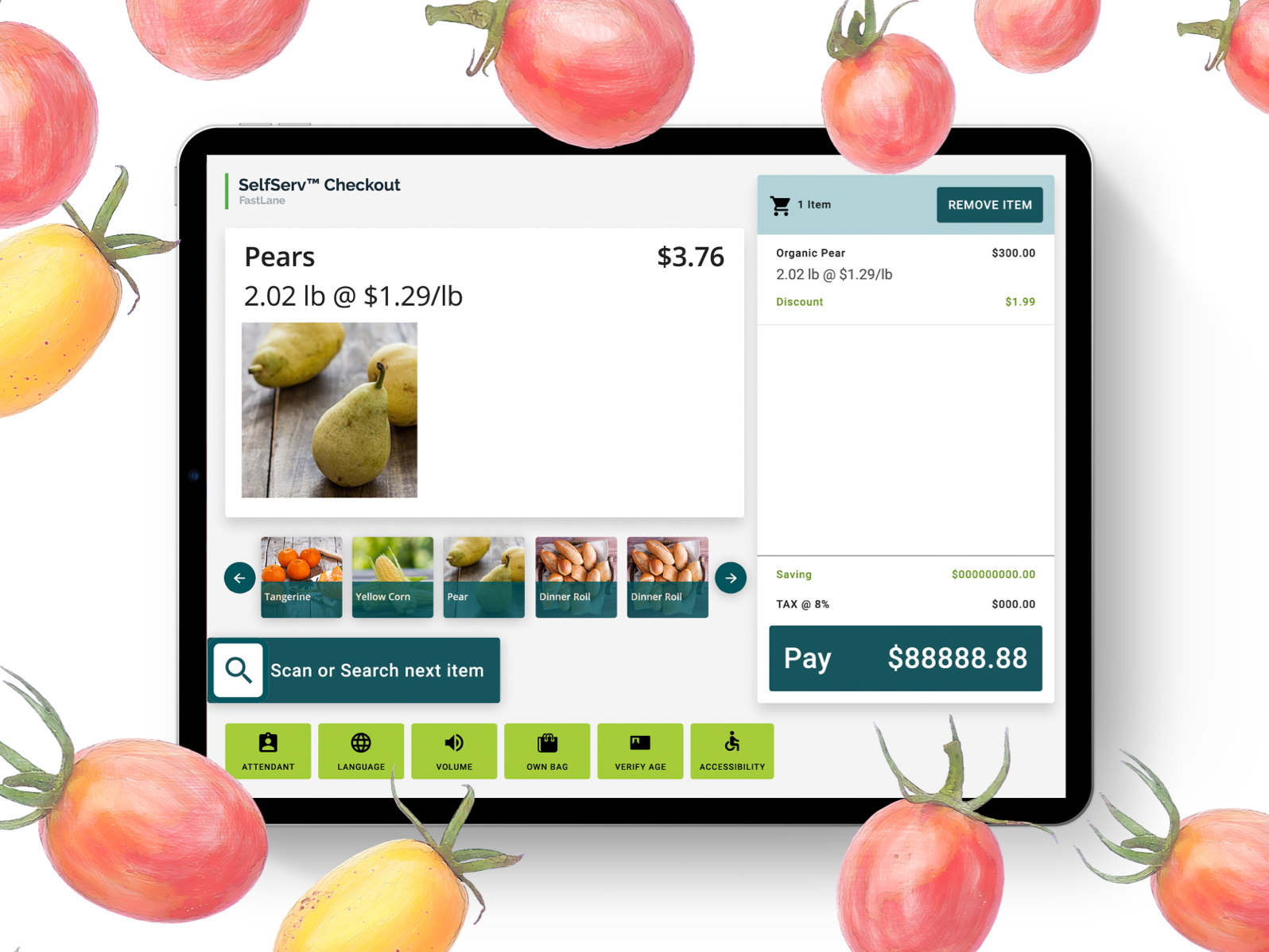
Below in Figure A below, we highlight the success area at the bottom left of the screen in green, with over half of our clicks occurring in the area outlined in red – which corresponds to the animated region. Conversely, Figure B showcases a refined animation strategy where the success area is highlighted in green with a high rate of clicks, indicating improved task success rates. These examples vividly illustrate how animations, when utilized judiciously and in alignment with user needs, can significantly enhance the overall user experience.

Future Efforts
Looking ahead, I recommended increasing our research efforts in interactions where animations are present within the self-checkout prototype. This approach is rooted in leveraging empirical data and user feedback to refine and optimize animations effectively.
By delving deeper into each animation's impact and functionality, the goal is to uncover insights that will serve as a guide in making informed decisions. This proactive approach not only strengthens understanding of user needs but also allows for delivery of a compelling and user-friendly self-checkout system that exceeds expectations. Below is a proposal to examine the payment screen animation.